WBO BRAND
公司品牌Logo由WBO三個英文字母構成,具有雙重意義。字面意義為公司萬寶英文"WAN BAO MOTOR"的縮寫,另外字母分別代表著"Win"、"Brave"及"Overcome",與公司自行研發的創新精神相互輝映,期許公司成員勇於求新求變,不斷自我突破,以追求業界技術領先地位,強化團隊合作的綜效,履行我們對客戶的品質及服務承諾。
在顏色的選取上以綠色及紅色作為公司品牌的基本色調。綠色象徵著在大地上成長茁壯的植物,傳達本公司對自有產品技術的信心與堅持,提供機車駕馭時的穩定及可靠。而紅色則代表創新積極,充份展現公司對於創新技術研發的渴望及領先地位的追求決心。
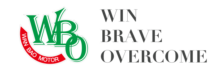
Our brand WBO has a double meaning. For one, it refers to the company English name, Wan Bao Motor Co. Ltd. Back then, The characters W, B, Q represent "Win", "Brave" and "Overcome" respectively means our own R&D spirit and in pursuit of industry-leading technology, and strengthen the synergy of teamwork to achieve our quality and customer service commitment.
We choose green and red as the basic color of the company's brand. Green symbolizes the growing strong plants convey stability and reliability of the company's own products and technology, adhere to faith, and to provide control when the locomotive. The red represents a positive innovation, pursuit of the company to fully demonstrate the desire for innovation and technology development and leadership determination.


